
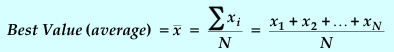
Figure 1-1: Sample Histogram for 100 Measured Values
(bin size = 2.0)
PRELAB
VIDEO
Look at a preview of the lab activities.
PURPOSE
You will measure a quantity that is subject to random errors in order to apply some statistical concepts to the analysis of data.
DISCUSSION
In science, an experiment is used to test the validity of a theory. Any experiment used to test theory usually involves the measurement of quantities whose values are predicted either directly or indirectly by the theory. However, since all measurements are subject to uncertainty, it is not enough to just make the measurements. A detailed evaluation of measurement uncertainties (or errors) and how much uncertainty they produce in the result are necessary to any test of a theory.
In the direct measurement of a physical quantity, such as the length of a rod with a vernier caliper, repeated measurements may give the same result. In that case the uncertainty of the measurement is set by the least count of the measuring instrument. That situation will be studied in Experiment 2 on Measurement.
This experiment will test your reaction time, in which repeated measurements do not produce the same result. The variation in the measurements is much greater than the least count of the measuring instrument. If these measurements are to be of any use, you need a way of reporting both the measurements of the reaction time and its variation. A histogram, or frequency plot, is a method of doing this graphically.
A histogram is a diagram drawn by dividing the original set of measurements into intervals of convenient width (or "bins") and counting the number of measurements (or "frequency") within each bin. For instance, when your instructor shows you a distribution of the grades in a class, a histogram will be displayed. If the number of measurements becomes very high (approaches infinity) and the bin size becomes very small (approaches zero), the histogram approaches a continuous curve that is called a "distribution curve".
Figure 1-1: Sample Histogram for 100 Measured Values
(bin size = 2.0)
In Figure 1-1, there are
8 events in the range 4 < x < 6; 10 in the range 6 < x < 8;
27 in the range 8 < x < 10; etc. The histogram
visually presents the measurement distribution but does not directly provide
the best value of the measured quantity or the uncertainty. As you might
suspect, the best value is near the middle of the distribution and the
uncertainty is related to its spread. Statistical theory suggests the best
value is simply the average of our measurements,
![]() .
.
where:
N = the total number of measurements
xi = the value of the measurement number i, where i is a number ranging from 1 to N.
The width of the distribution is related to the deviation of the individual readings from the "best value". In statistics, the following useful quantities can be defined :
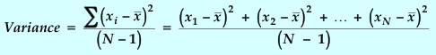
![]()
![]()
or
You can use your intuition about
averages to understand these statistical quantities. Intuition says that ![]() is likely to be a "good" value for x if the individual measurements which
are averaged are "clustered close together" in value. Secondly, an average
generally improves if more measurements are averaged. Therefore, you can
expect that the uncertainty in an average should decrease as the number
of measurements increases and as the width of the distribution decreases.
The Standard Deviation s, is the statistical function that defines
how "closely clustered" the measurements are. The value of s is related
to the width of the frequency distribution and is a measure of the average
error per measurement.
is likely to be a "good" value for x if the individual measurements which
are averaged are "clustered close together" in value. Secondly, an average
generally improves if more measurements are averaged. Therefore, you can
expect that the uncertainty in an average should decrease as the number
of measurements increases and as the width of the distribution decreases.
The Standard Deviation s, is the statistical function that defines
how "closely clustered" the measurements are. The value of s is related
to the width of the frequency distribution and is a measure of the average
error per measurement.
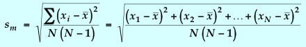
However, since increasing the number
of measurements does not decrease the average error per measurement, s
cannot itself be the uncertainty in the average value. The Standard Deviation
of the Mean, sm,
most closely matches in behavior our intuitive feeling about the uncertainty
in an average value. Since sm
= s /![]() ,
we can decrease our uncertainty in an average by increasing the number
of measurements or by improving the individual measurements (decreasing
the average error per measurement).
,
we can decrease our uncertainty in an average by increasing the number
of measurements or by improving the individual measurements (decreasing
the average error per measurement).
If the number of measurements is large and the errors are random, the distribution curve that results for both the data points and the average values approaches the "Normal", or Gaussian Distribution.
The Gaussian distribution has the following characteristics:
a. The curve is symmetric about the peak value, falling to zero on each side (bell shaped).
b. The peak value equals the average value.
c. The area enclosed by ±σ (the standard deviation of a Gaussian distribution) around the peak will contain 68% of the area under the curve. That means there is a 68% chance that one measurement will fall between
- σ and
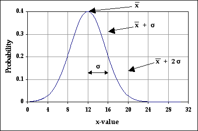
Figure 1-2: Gaussian Distribution Curve
σ = the Standard Deviation of a Gaussian Distribution
d. The area around the peak enclosed by ±2σ is 95% of the total area under the curve. That means a measurement has a 95% chance of falling between
Just as s is our best estimate of σ and confidence limits for the individual data points, sm is our best estimate of σ and confidence limits for the mean. Since our final result is usually a mean value, sm usually represents our confidence in the final result. In other words, to have 95% confidence in the quoted result, an error range of ±2sm should be quoted. Likewise, for 68% confidence, an error range of ±sm should be quoted.
Print out and complete the
Prelab questions.